Welcome!
This is the community forum for my apps Pythonista and Editorial.
For individual support questions, you can also send an email. If you have a very short question or just want to say hello — I'm @olemoritz on Twitter.
Binary files read and write
-
OPEN "test_tr.bin" FOR OUTPUT AS #2
REM BEGIN THE FOR - NEXT LOOP TO READ HOUR CHUNKS
count = 1
startm = timeSTART(1)
endtm = timeEND(1)
PRINT "START DATA POINT "startm
PRINT "END DATA POINT "endtm
REM LOOPS UNTIL THE START DATAPOINT IS FOUND. NO WAY TO ACCESS THERE DIRECTLY
FOR k = 1 to endtm
GET #1,,a
IF k < startm THEN
    GOTO 200 REM LOOP
END IF
REM ***LOOK FOR INFINITE AN NAN SPL VALUES
isinf# = a
isnan# = a
i = math.isInf(isinf#)
j = math.IsNaN(isnan#)
IF (i <> 0) OR (j = 1) THEN
    PUT #2,,v REM dB VALUE*v = 33.33333 WHEN NAN OR INFINITES ARE DETECTED
badspl = badspl  + 1
GOTO 100
This is the BASIC code I use To clean up NAN and Infinites. This prevents you, if you clean up in block, to change the order of SLOW and FAST values when you read data in one column and then you transform to a 2D matrix
In en second time and before transforming the sequential values to a 2D matrix I look for the flag value 33.333333 and replace it with the logarithm average of the preceding 10 SPL values if n > 10 or the next when n is <= 10 -
Did you run SPLnFFT_strip.py? Does that do something useful for you or not?
Do you still get INFs and NaNs in files generated by the current SPLnFFT app? Can you please add an INF_counter and a NaN_counter to your basic program and tell me how many of each that you are seeing in files generated by the current SPLnFFT app?
-
Do you have the beta?
i created SPLView which is an interactive plot for this data.
https://github.com/jsbain/objc_hacks.gitIn order to handle the problems with a million points in a plot, the data is resampled, so that there are only ever 500 points in a plot. When zoomed way out, each point of the fast represents the peak of the fast signal over about ~3 minutes, while the slow is resampled using a log average (this seems appropriate for what you are doing, since i think you are interested in how far the fast peaks are above slow average).
As you zoom, the data is continually resampled, to always keep 500 points onscreen, meaning as you zoom, each point starts represnting less and less time. This way, you can first find interesting peaks from the wide view, then zoom to an area of interest, and eventually get the full resolution data.
The code that does the resample is
here.If you dont have the beta, let me know, it would be easy to convert the touch handling to a non-beta interface.
-
SPL DATA START READING AT 19:14:53 CEST
START DATA POINT 1
END DATA POINT 55760
NaN
SPL DATA ENDED READING AT19:18:27 CEST
TOTAL CHUNK LENGTH 2788
SOURCE FILE LENGTH 5306560
VALID DATA SAVED IN THE SANDBOX : 5576
BAD VALUES (NAN OR INFINITE) DETECTED : 1
FILE LOAD ENDED AT 19:18:27 CESTThis is the output OF a SPLNFFT FILE analyzed with my program . The wifi speed was AT THIS TIME OF 5.8 MB
-
Did you run SPLnFFT_strip.py? Does that do something useful for you or not?
-
Not yet, but of course is useful to process SPL data in the Pytonista enviroment. I'll try it with a full 24 record of a MD that works transporting critical patients in an Ambulance. I sent him the SPLnFFT App. The record will be done with an iPhone 6. I'll send you the results when they are available. Another practical application is to monitor at bed time people that snores since they're prone to sleep apnea that may be dangerous for health. The measures of the app are accurate and render the same SPL values of that registered with a professional class 2 SPL meter that I use to calibrate it. By the way there are a free sample for evaluation of techBasic, the techSampler. There you can observe how easy is to plot high quality graphics with pinch gestures.
-
JonB, If you're talking about a new beta update of phytonista the answer is no. If is about the template to compile the scripts into a stand alone app with Xcode, the answer is yes; I downloaded yesterday the Zip file that will be installed in a Mac mini with Yosemite when I solve the problem of repeated phishing attempts that my antivirus blocks. It seems it's related to the Apple Store ID . I also have read the code for resampling the SPLnFFT data to plot graphics with pinch gestures. Since I'm a beginner in Phytonista, It's complicated for me to understand how you link the SPLnFFT data file to this script.
-
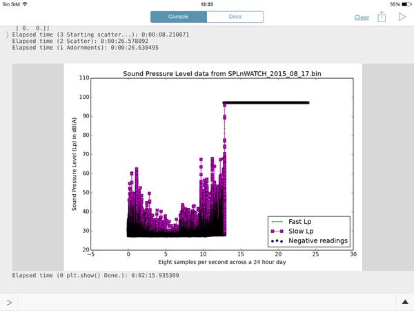
CCC, this is going to make you happy. This is the processing time of a 15 hours continuos recording with SPLnWATCH, a child App of SPLnFFT. It records in the background with a minimal battery usage (about 13%)
Elapsed time (3 Starting scatter...): 0:00:01.277414
Elapsed time (2 Scatter): 0:00:19.745673
Elapsed time (1 Adornments): 0:00:19.818221
Elapsed time (0 plt.show() Done.): 0:02:09.151619The graph output is nice an fit well to the recording tines. I wish I new how to send it to you because I'll try to make it with your latest option by hours chunks.
CONGRATULATIONS FOR YOUR GREAT SCRIPT. -
I wish I [k]new how to send it to you
If you have a free login to GitHub, you should be able to go to https://github.com/cclauss/SPLnFFT_tools and click the "+" to add a new file to the repository. Provide a reasonable name with the proper extension (.png, .jpg, etc.). You will then have to click the "Propose new file" and then "Create pull request" button a few times.

-
I made a screenshot and sent the image to the Twitter account @olemoritz to send it to you. Do you have a Twitter account?. It's simpler for me
-
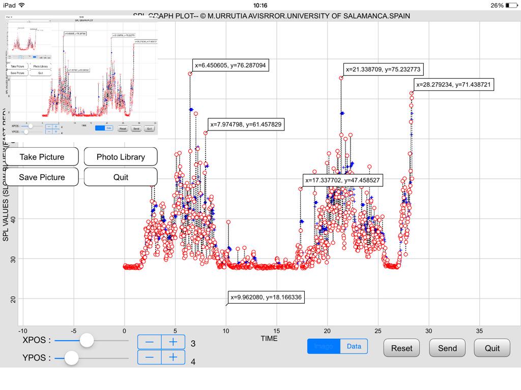
This is the image that I got from @ManuelU via Twitter.
It shows why we want to preprocess our SPLnFTT.bin data files with SPLnFFT_strip.py. The hours from 14h thru 24h contain all zeros. That script would remove those null hours which would
- decrease file size
- reduce upload time, and
- give us higher resolution plots.
And here is a plot from his TechBasic program:
-
@ManuelU, I created a new repo https://github.com/cclauss/SPLnFFT_tools for the code from this thread and updated the links above to point to that repo. I have also included a new binary file of me snoring. Please tell me what the threshold of danger is for snoring. My wife assures me that I am way over that limit but it would be good to get a second opinion.
Do I understand SPLnWATCH correctly? Is that an AppleWatch app that records noise levels? If so, we could get @Phuket2 to use it to tell us which of his favorite bars has the most impressive Sound Pressure Levels.
-
@ccc , LOL, yes I will be the data collector for the bars. Some poor soul like me has to do it :) I also have netatmo (inside, outside and rain module) but the last time I looked I thought there was no python API. I also have Phillips Hue lights. I have seen there are modules to interact with the hue lights API (I think on the tools site). But could be funny to have your snoring levels controlling the lights :)
-
Hi. It depends on frequecy during the whole sleep time, the apnea periodos and the background medical context for each person. Right now I don't know what are the critical values for both parameters. I'll make a peer view on the topic in Internet and I'll.send to you the best links. Key words would be: sleep apnea etiology clinics ,diagnostic and treatment. I record noise with the iPad version of SPLnWATC I, think it's universal, but you need to adjust the settings in the mother App, SPLnFFT. I use the watch version because can record in the background, which supposes a battery and screen saver. You haw to buy the 24 hours record option and have a Dropbox account. that's all. Hope it helps
-
-
@ccc , thanks. Is great to have. In itself, not Exciting (the dashboard app is great), but combined with hue lights could be a lot of fun. I know if than then, but it's just too slow to have real time fun :)
-
here is a slightly different take (on the original wuestion:dynamic matplotlibs). this one is written so it should be compatible with 1.5, as it uses plain touch handling.
the approach i took was as follows: there are zoomable scrollbars in top and size, which van be pinched or scrolled. the width of the bar represents the fraction of a day on the screen. i dont have the skeomorphism tuned quite right, it is slightly awkward i admit. finer panning can be achieved by pulling finger down away from the bar while dragging, similar to the way videos work in safari.
after computing the zoom limits, the way i deal with the millions of points is to resample down to just a few hundred points on the scren... which after all is about all you can see anyway given fixed resolution of the device. i do that by calculating how many of the original data points lie within each resampled point, and then compute the peak signal (for the fast data) and log average (for the slow), then only plot those points. in addition, setting the dpi for the matplotlib image low during dragging makes this reasonably responsive.
One thing i learned...
ui.in_backgroundis not the same as as threading.Thread... the former seems to queue up commands all on a single background thread, rather than creating a new thread each time. hence therun_asyncdecorator which i copied from SO.see ZoomSlider and SPLView11 at
https://github.com/jsbain/uicomponentsNext TODO would be to add single touch data "cursor" inside the plot.
-
@ManuelU, generating new hourly files with this new version of SPLnFFT_hourly_split.py should allow you to plot them again.
-
@ccc I noticed now that iTunes File Sharing is not supported even when you connect your iOS device with a cable to a desktop computer
-
@ManuelU this was changed in Build 160025. From the release notes:
iTunes File Sharing is no longer enabled (this was temporary anyway, but with the new internal directory structure, it wouldn't actually work anymore)